Our Portfolio
Solve problems.
It’s how we were designed. It’s what we do.
Use the menu below to sort through projects by type. Click on a project profile to read the full brief.
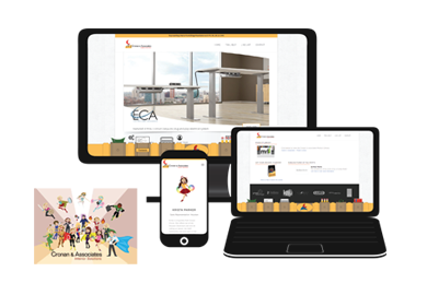
“Our Powers Need to Be Showcased Better” —Web Development for Cronan & Associates
Cronan & Associates doesn’t like making tools for people to use if they can’t find them.
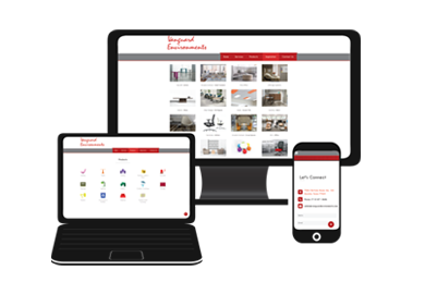
“We Need Something New but Don’t Know What It Looks Like” —Web Design for Vanguard Environments
We gave Vanguard Environments a makeover to catch the eyes of humans and computers.
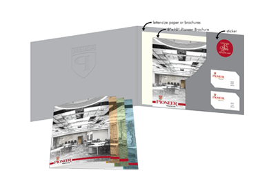
“How Do We Let Our Customers Know We Do So Much More?” —Sales and Presentation Materials for Pioneer Contract Services
We tripled business opportunities using only 1 brochure.
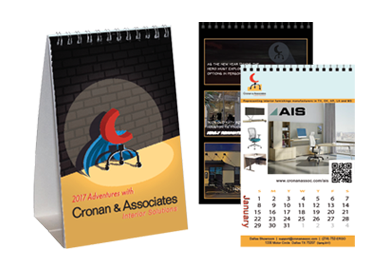
“Our Old, Ready-Made Template Doesn’t Show Who We Are” — Desk Calendars for Cronan & Associates
We turned Cronan & Associates and their lines into superheroes.
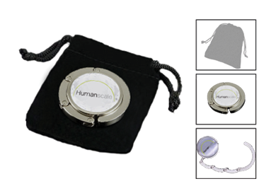
“We Need a New Giveaway that Reflects Our Brand of Purpose and Function” — Promotional Swag for Humanscale
We’ll brag: this bag swag won’t lag. But wait! There’s more!
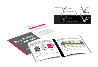
“We Want a New Look for Our Story” — Logo and Brand Standards for Vanguard Environments
Our team wrote Vanguard Environments’ 1000-word story with just a picture.
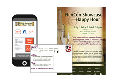
“We Don’t Have a Lot of Time, But People Need to Know About This” — Email Advertisement for KSM Resources
KSM Resources was racing against the clock to advertise their huge event.
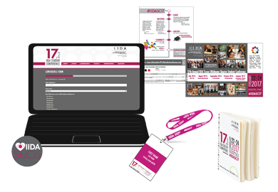
“Our Event Needs to Capture Attention Without Costing a Fortune” — Website Updates and Content Development for IIDA Student Conference
The IIDA (TX-OK) needed some caffeine for their online registrations.
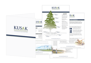
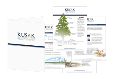
“People Don’t Know How We Work” — Sales Literature for Kusak Wealth Management
6 Steps to Get Rich using Kusak Wealth Management’s Sales Tools.
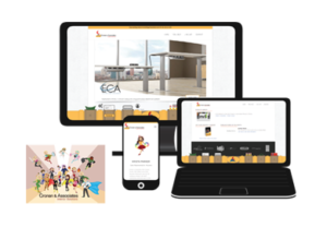
“Our Powers Need to Be Showcased Better” —Web Development for Cronan & Associates
Problem: Cronan & Associates delivers incredible interior solutions to their clients by providing a variety of planning tools and product options, but those items weren’t easily-located on their website. Their team members needed these to be accessible to better serve their customers and business partners.
Solution: By employing their new superhero branding, we revamped their website design and created a custom Utility Belt to highlight key user tools such as a Budget Calculator, Purchasing Contracts, and a Resource Library. Cronan & Associates, now armed with a high-powered website, has the competitive edge to stand against their competition and the Interiors of Doooooom.
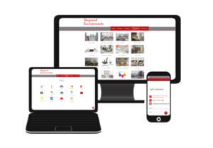
“We Need Something New but Don’t Know What It Looks Like” —Web Design for Vanguard Environments
Problem: Vanguard Environments came to us with a general idea of what they wanted to communicate on their website: their position as an industry resource and primary connection for furnishing office environments. The dealership recently changed ownership after 24 years in business. They knew they needed a digital marketing makeover but didn’t have a clear picture of what they should have or what was possible.
Solution: We developed custom content for their website, expanded on existing content, and redefined their brand as a true resource for the industry. The website was restructured to generate deeper user engagement, and an SEO foundation was developed to support long-term growth of their digital marketing presence alongside their direct operational and sales growth. The new website served as a platform for planning additional tools and testbed for future branding exercises. While Vanguard Environment’s problem was broad, we implemented specific plans to deliver clear, effective possibilities through purpose-built marketing.
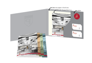
“How Do We Let Our Customers Know We Do So Much More?” —Sales and Presentation Materials for Pioneer Contract Services
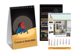
“Our Old, Ready-Made Template Doesn’t Show Who We Are” —Desk Calendars for Cronan & Associates
Problem: Cronan & Associates is a unique rep group for highly-versatile, commercial interiors where each team member is known for their superhero-like abilities to support their clients. Their management approached us to create something new for their annual desk calendar because the ready-made, stock templates didn’t display them or their lines effectively.
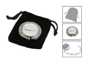
“We Need a New Giveaway that Reflects Our Brand of Purpose and Function” —Promotional Swag for Humanscale
Problem: Humanscale has stylish, customer-centric approaches to ergonomic furniture that are clever, attractive, and incredibly useful. They came to us in search of new tradeshow marketing swag that would have an accurate showcasing of their brand and specifically connect with their female demographic.
Solution: We took the Humanscale belief that “the best designs are based on purpose and function” and illustrated it in full-color, collapsible, branded purse hooks. These resourceful, smart, pragmatic trinkets offer a new approach to conventional sales giveaways and mirror Humanscale’s take on convenience, performance, and customer satisfaction. This also proves that purpose-built marketing delivers strong gains through being in line with how your business does business.
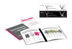
“We Want a New Look for Our Story” —Logo and Brand Standards for Vanguard Environments
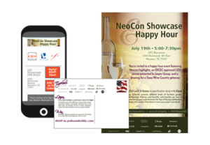
“We Don’t Have a Lot of Time, But People Need to Know About This” —Email Advertisement for KSM Resources
Problem: If you have an event that can benefit a lot of people, you want people to know about it and go (especially if its free). KSM Resources had just that, and they came to us to help get the word out. It didn’t help that the event was to be held during the weeks following a major trade show, thus flooding the inboxes of their target audience with mass-mailings. Getting it to the right people seemed impossible to KSM Resources.
Solution: Their materials needed to be like nothing anyone else was sending; it needed to pop. We attacked the problem by designing a purpose-built social-media and graphics marketing package. Physical and digital graphics were designed to work in multiple formats and means of delivery. All materials drove people to the e-blast that had an RSVP program built-in and a calendar scheduler that worked directly with e-mail platforms. Our efforts resulted in significant engagement, and registrations for the event skyrocketed past their expectations.
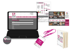
“Our Event Needs to Capture Attention Without Costing a Fortune” —Website Updatesand Content Development for IIDA Student Conference
Problem: The annual Student Conference from the International Interior Design Association’s Texas-Oklahoma Chapter hosts interior design students and professionals from around the country for a wealth of professional-development exercises. However, the event leaders needed help capturing registrations within their existing framework and communicating with students, educators, industry professionals, and underwriters.
